


Tottenberg: The Most Complicated Thing
Hits All The Points

Thu, Jun 3, 2021 at 8:21 AM
David,
Today I worked up yet another approach to the cover art. I've tried to follow your latest sketch. Blender rendered the basic image after which I spent some time in the Adobe Photoshop tweaking the exposures, color levels and sharpness. Then jumped into the Illustrator and married the image up to the text. Not certain about the result. If you like it, fine, or otherwise send through some suggestions.
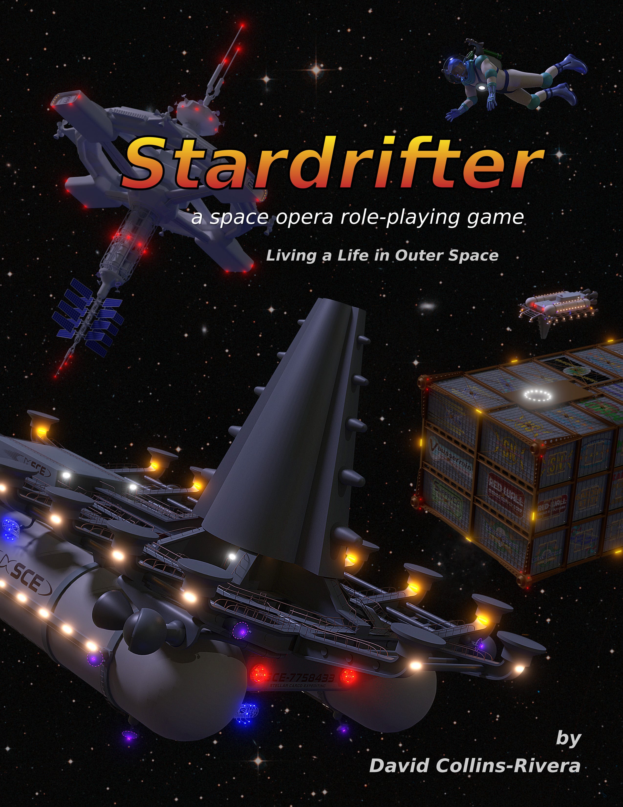
By the way, this is the most complicated thing I've ever put together with the Blender 3D program and I am definitely pushing the limits of my old(er) machine with the project. Blender has locked up on me more than a few times along the way which is something I'm not used to having occur. Probably running out of memory or whatever. But, older machine, older limitations. Hee! Hee!
And now for a wee glass of Roberta Batewell's... or something along those lines.
Cheers,
- Ignatz
Thu, Jun 3, 2021 at 12:12 PM
Ignatz,
I love this! It really hits all those points I had in my head. Do you like it?
If I had a note, it would be that the ship in the foreground (actually, the spaceman is in the foreground, I suppose, but you know what I mean), the ship could be made larger, extending right to the bottom of the image, and maybe a little off-screen -- not by much, just a hair. This is the one, though, I think.
Regarding the lighting, do you want to go with this, or do you want to go with a more conventional mono-directional aspect, as if from the central primary for the star system?
Regarding the title font, does this one work for you? I'm not sure.
But, yeah, I really like this!
Take care of your back. Relax, hot shower or bath, maybe. It's so easy to overdo things. I jacked up my back shoveling snow, and it plagued me for months. Don't do what I did for it, which is basically nothing.
I'm sorry to have pressed your machine to hard on this project! I'm sure you didn't expect anything like this when you offered to work on some simple sketches for me! No good deed...
-David